The rules of the game: revise, revise and REVISE.
There are rare moments in life where a fully-formed and perfected thing is created. More often in the creative arts, a final product is the result of countless iterations. Refinement thus becomes an art form in and of itself.
Let's take a look at a few images from Big Mo.
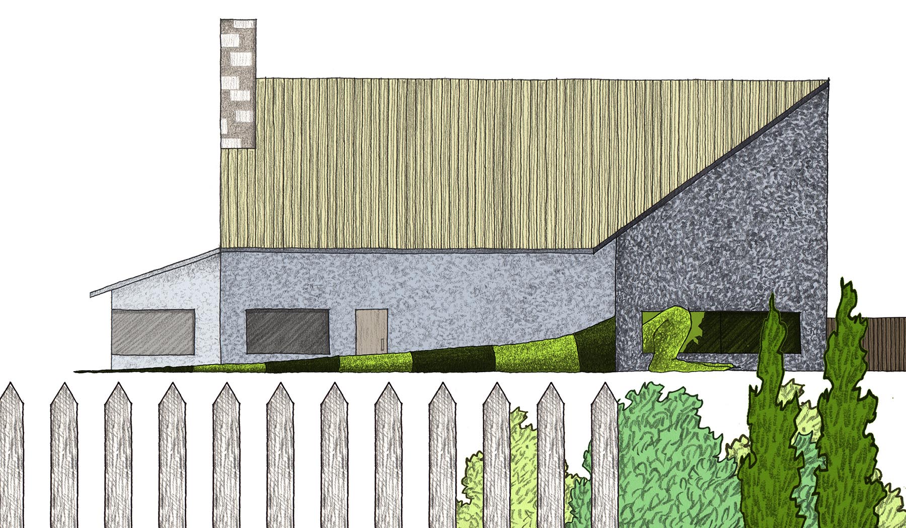
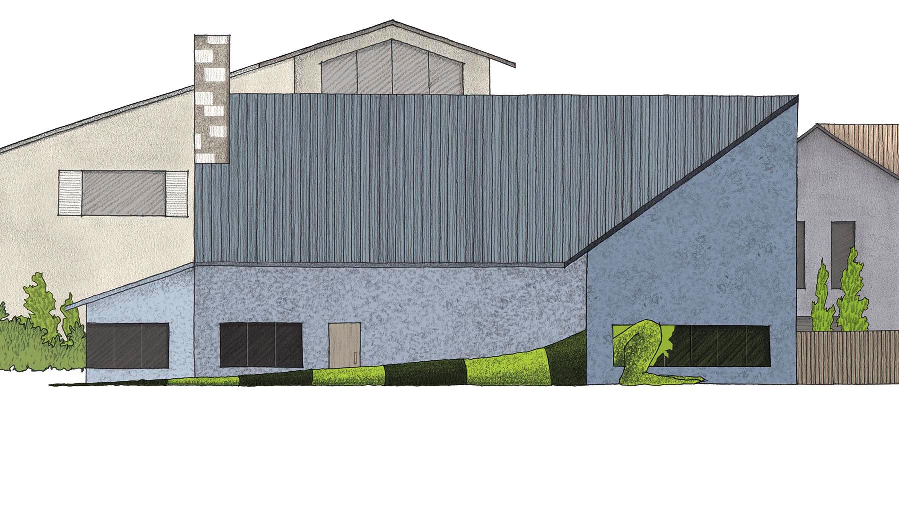
At this point in the story, the reader realizes for the first time that Mo is not simply going to grow larger than his tank - he's going to keep going! In my initial concept sketch, Mo is the size of the family van, enjoying a windshield wiper toothpick.
While this image does give an indication of his journey to come, it had two problems for me:
1. The car is too specific and realistic, and the setting in the garage was difficult to convey without using one-point perspective, which I hoped to avoid altogether for simplicity of visual style. **Note: more on perspective in a future post!
2. This scene is an important cue for the reader for the "speed" of Mo's exponential growth, and by this point, he should be much larger than a car. So, to keep the anticipation alive, I drew Mo as partially hidden inside the garage, presumably waiting to burst out!
The illustration was "blocked out" on the page, and only very minor elements, like foreground and color selection, were changed.
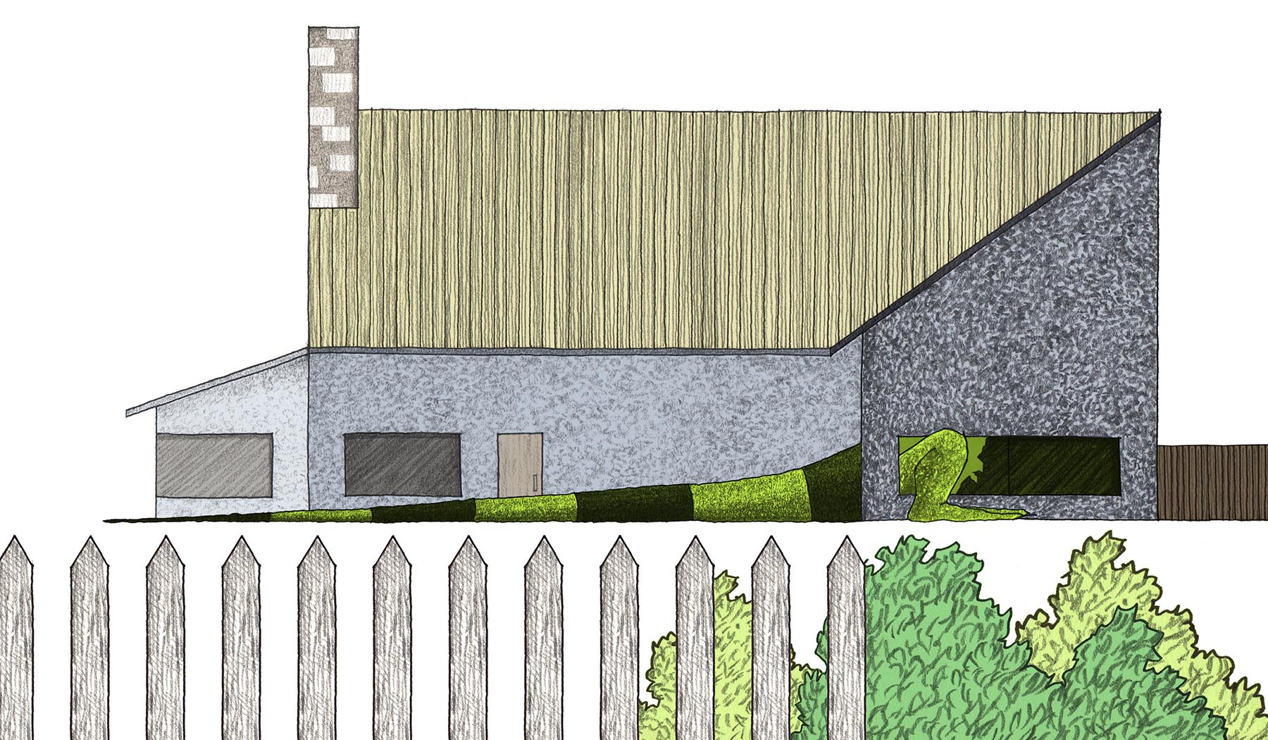
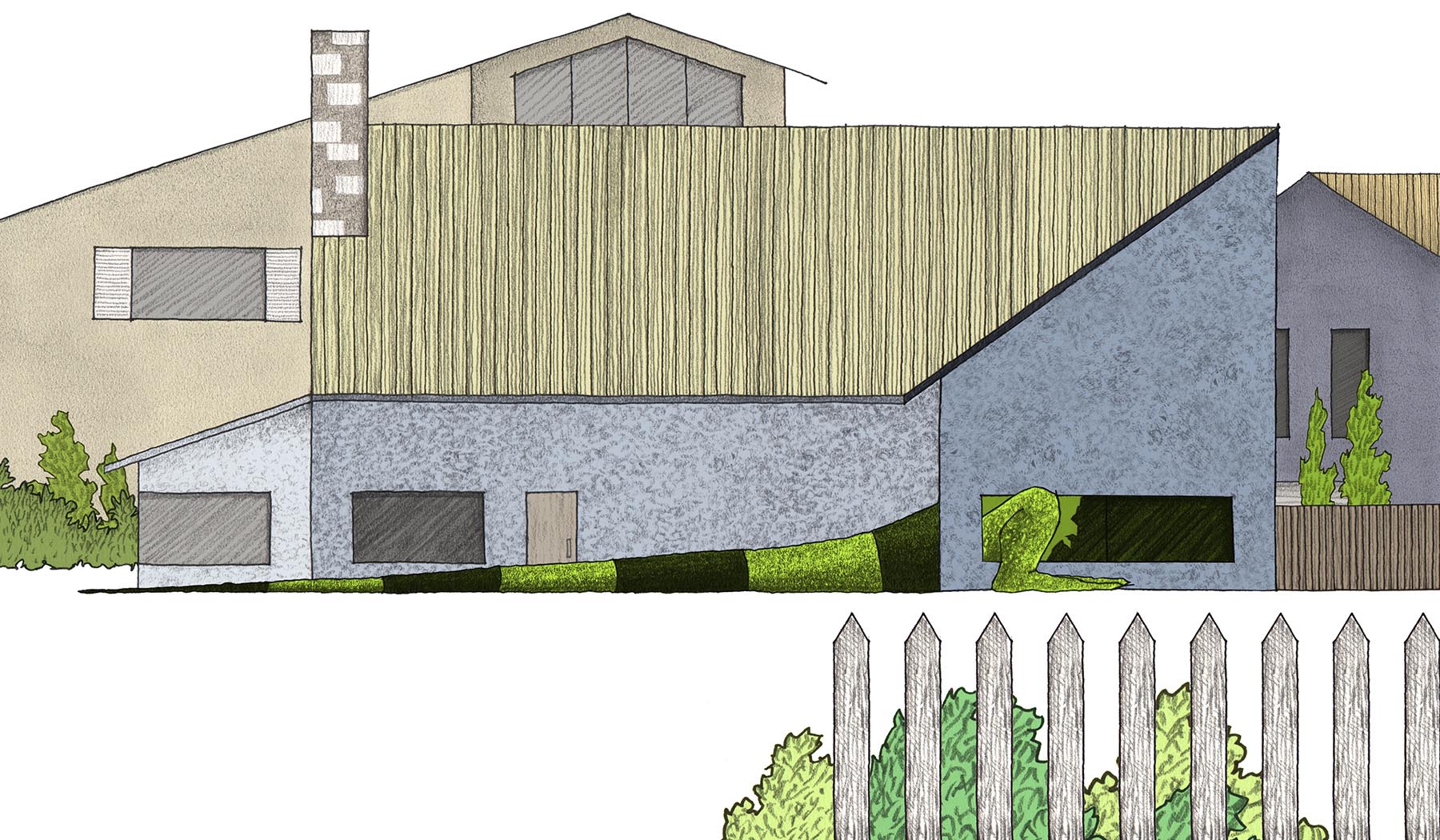
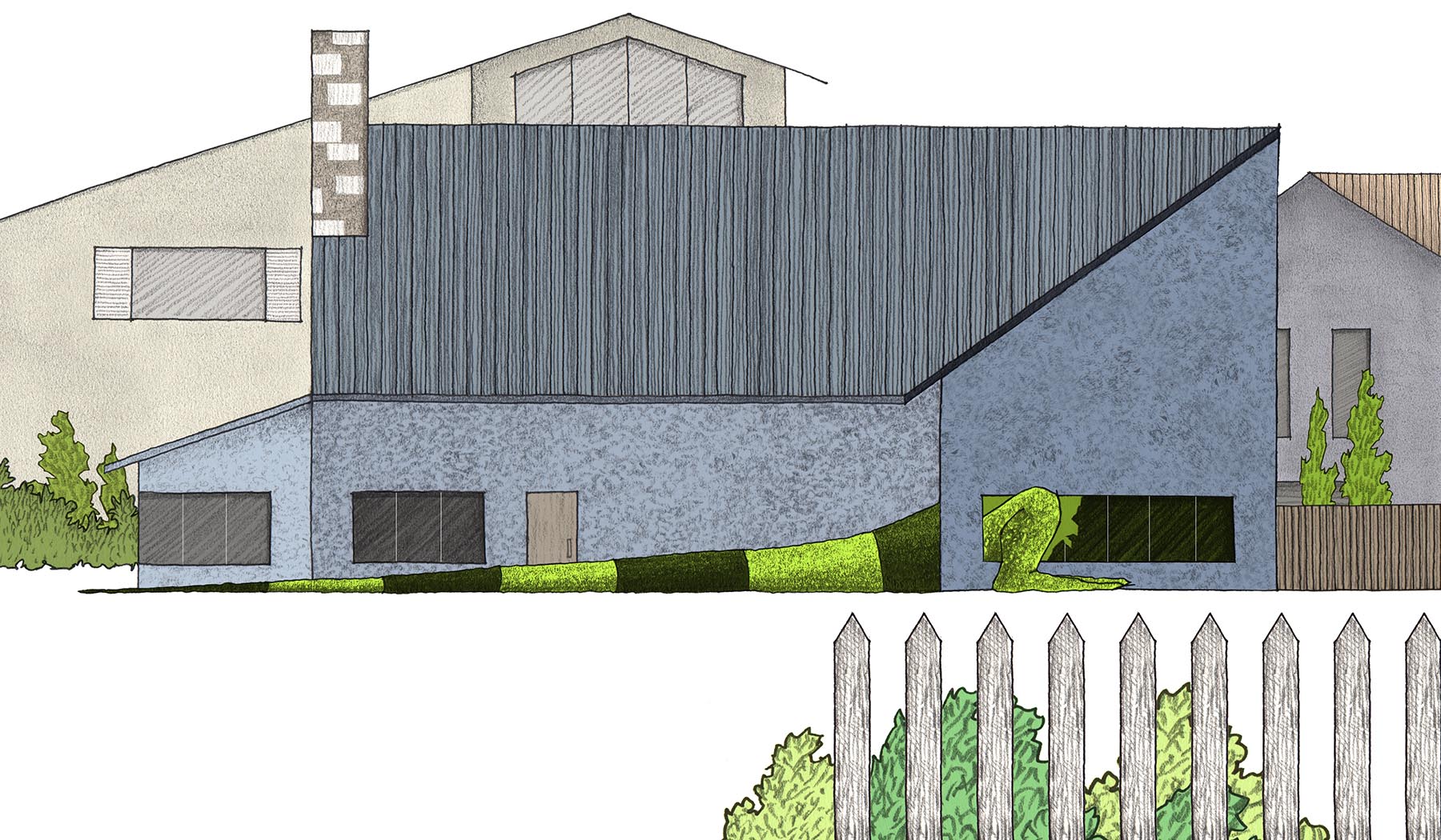
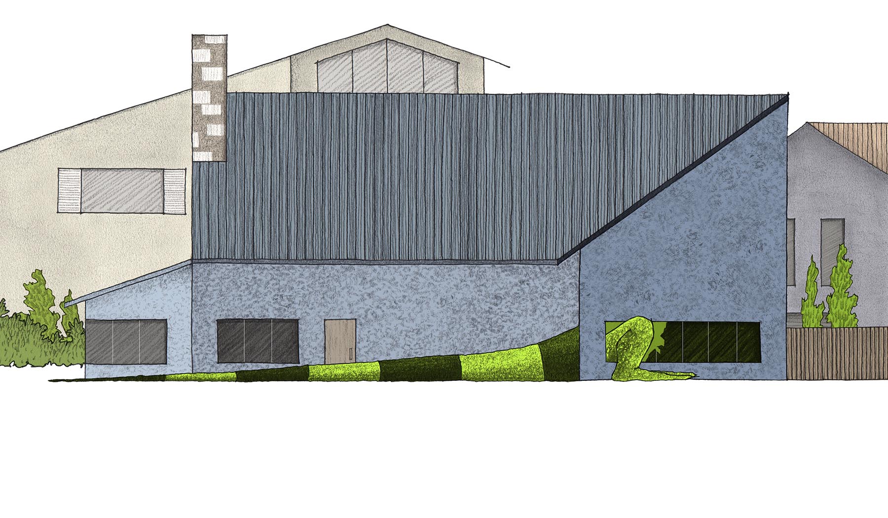
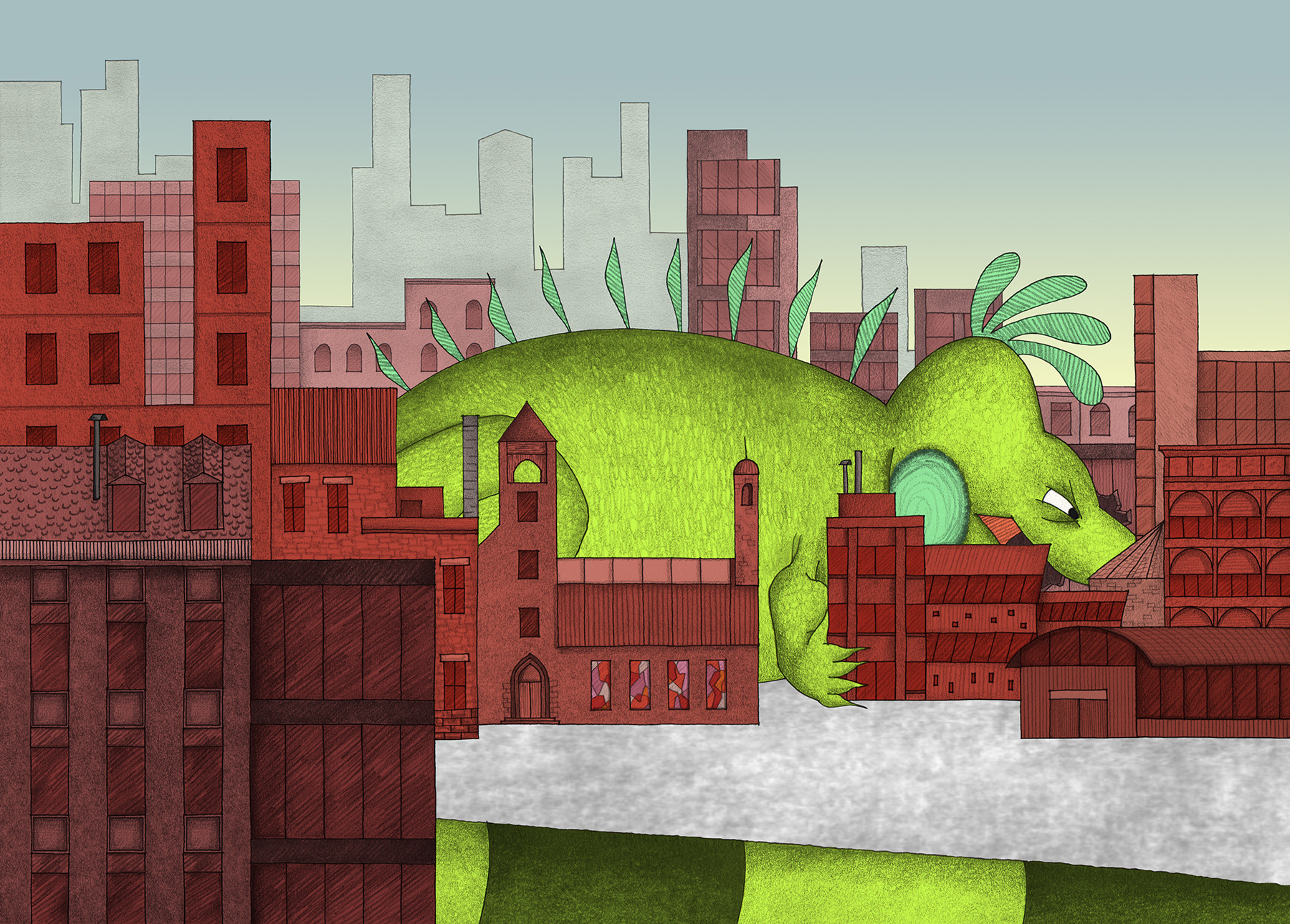
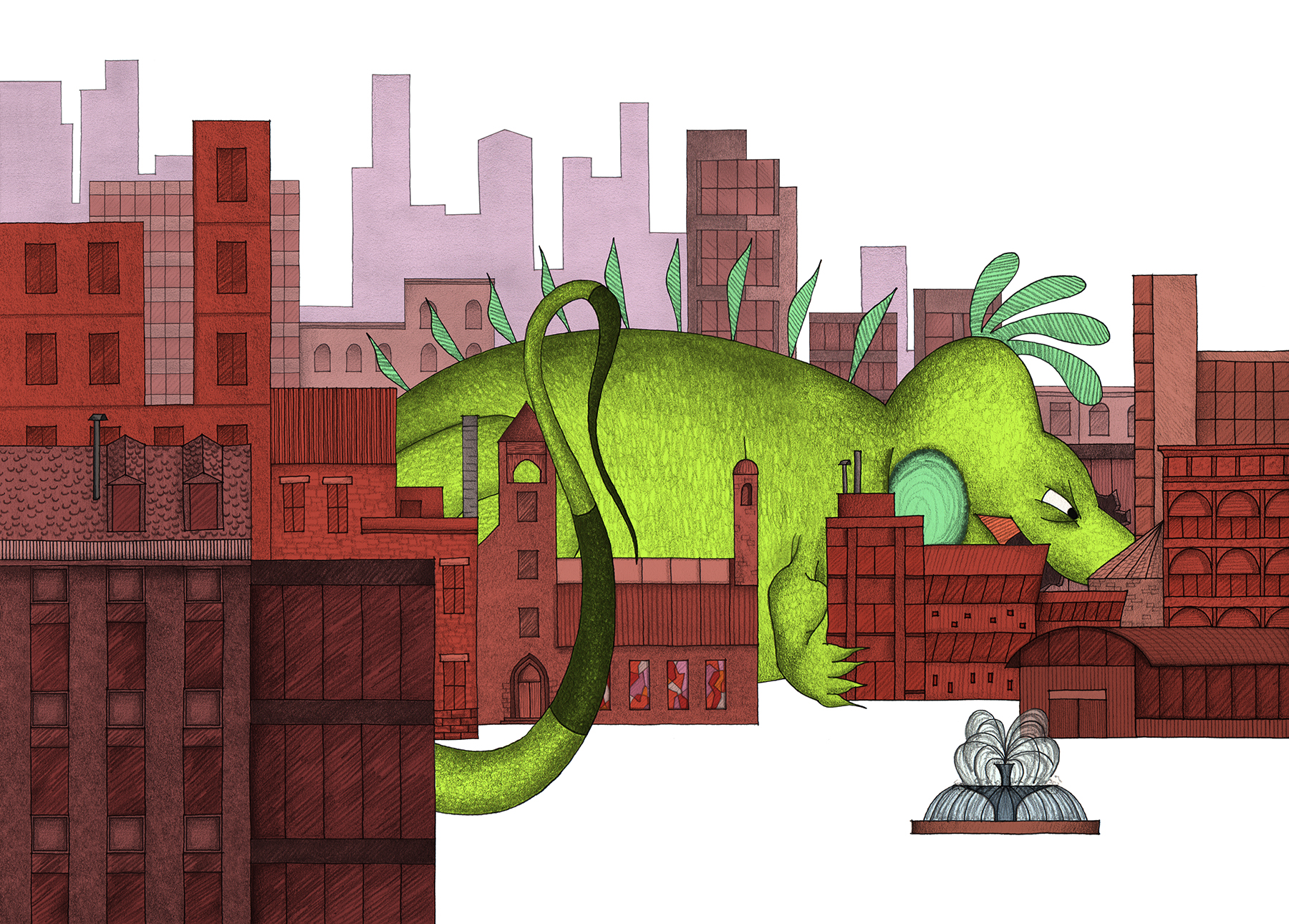
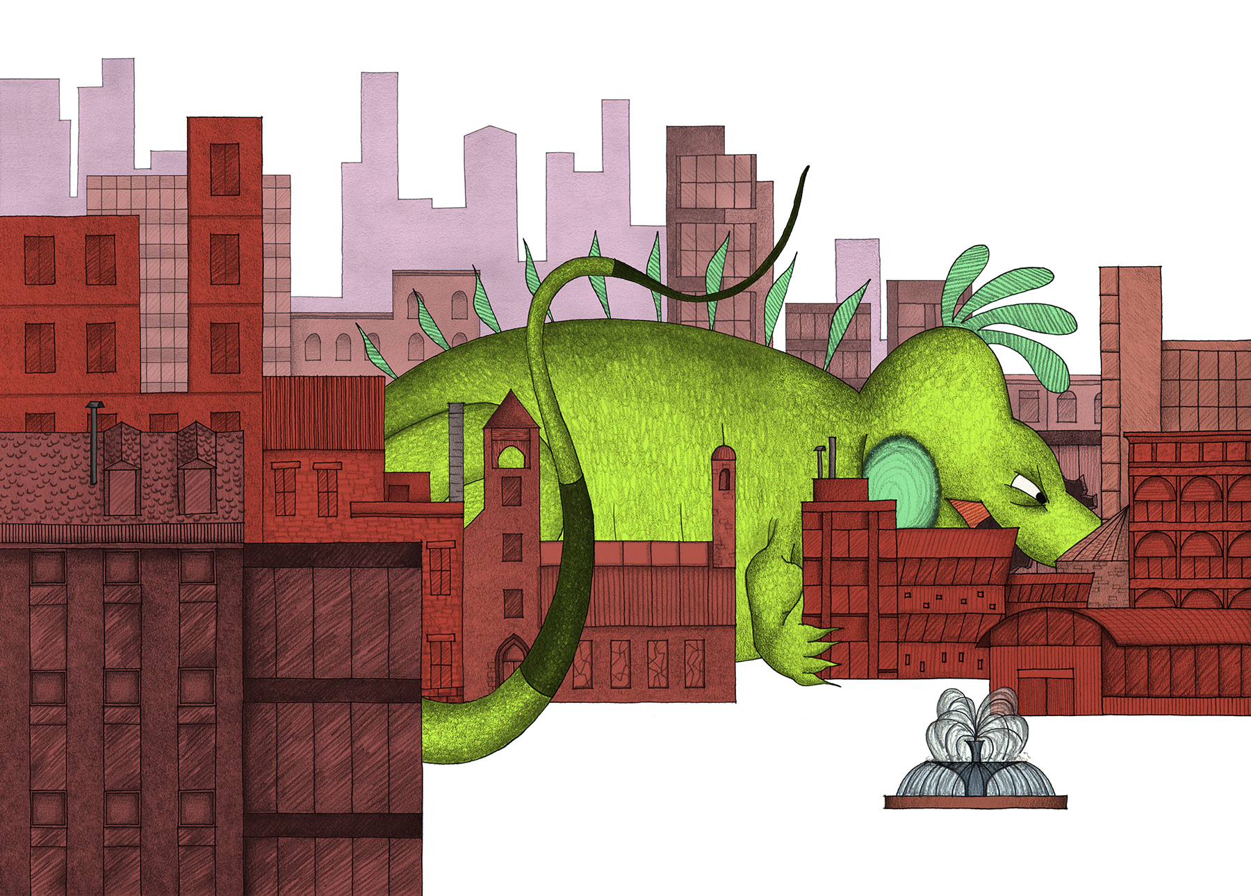
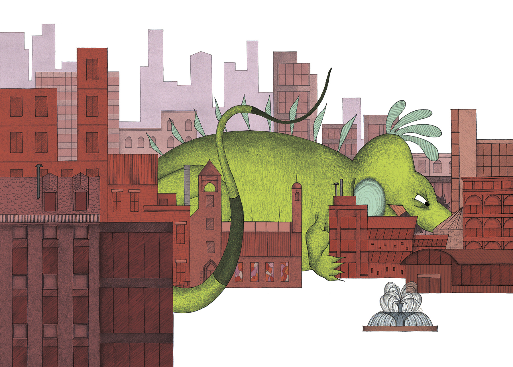
By the time Mo is as large as a city, his destruction is far-reaching. With his larger size, Mo's body began to encroach on the boundaries of the drawing page. This was a fun side effect, and meant that I could really play with the relationship between Mo and his surroundings. When flipping through the book, you may notice how his body tends to mimic the contours of the land around him, whether he is lounging on vineyards or weaving through a downtown maze, as with this scene.
The anatomy of an iguana is particularly suited to active and dynamic positions in "landscape format", with a bit of humor to boot!
This particular illustration forced me to make an important decision on the status of human figures (ie. to include, or NOT to include?). I decided to represent the presence of humans without actually drawing them. The concept of an iguana growing out-of-control is potentially scary to a child, so I took precautions to leave the people OUT. There was a visual implication to this, too, because humans would be no larger than dots as Mo's scale grew through the story!
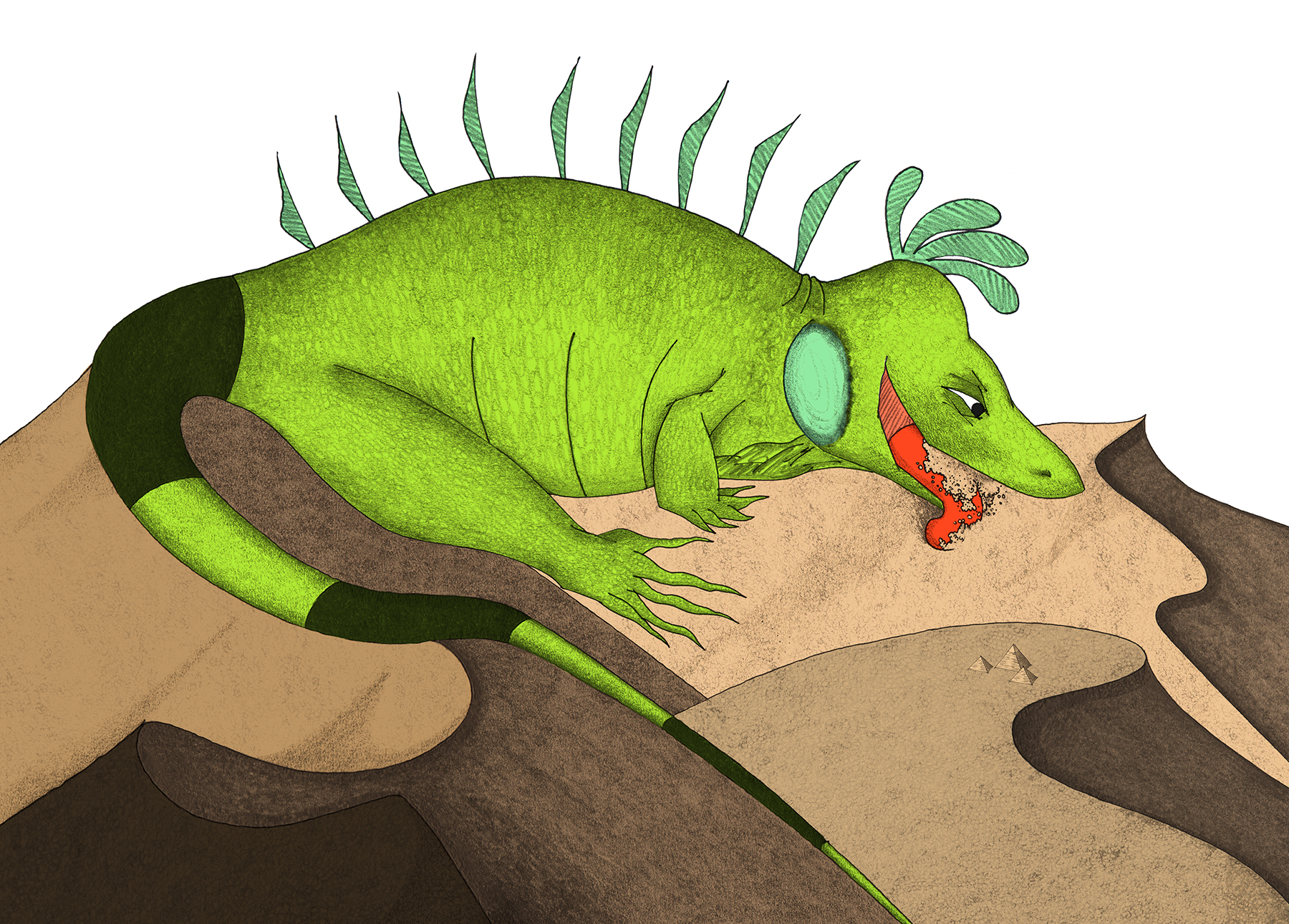
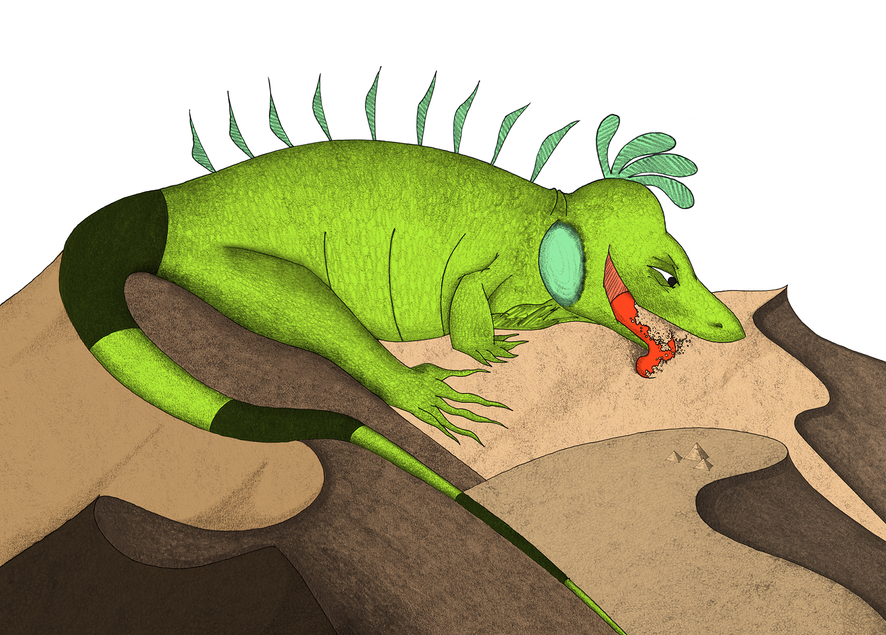
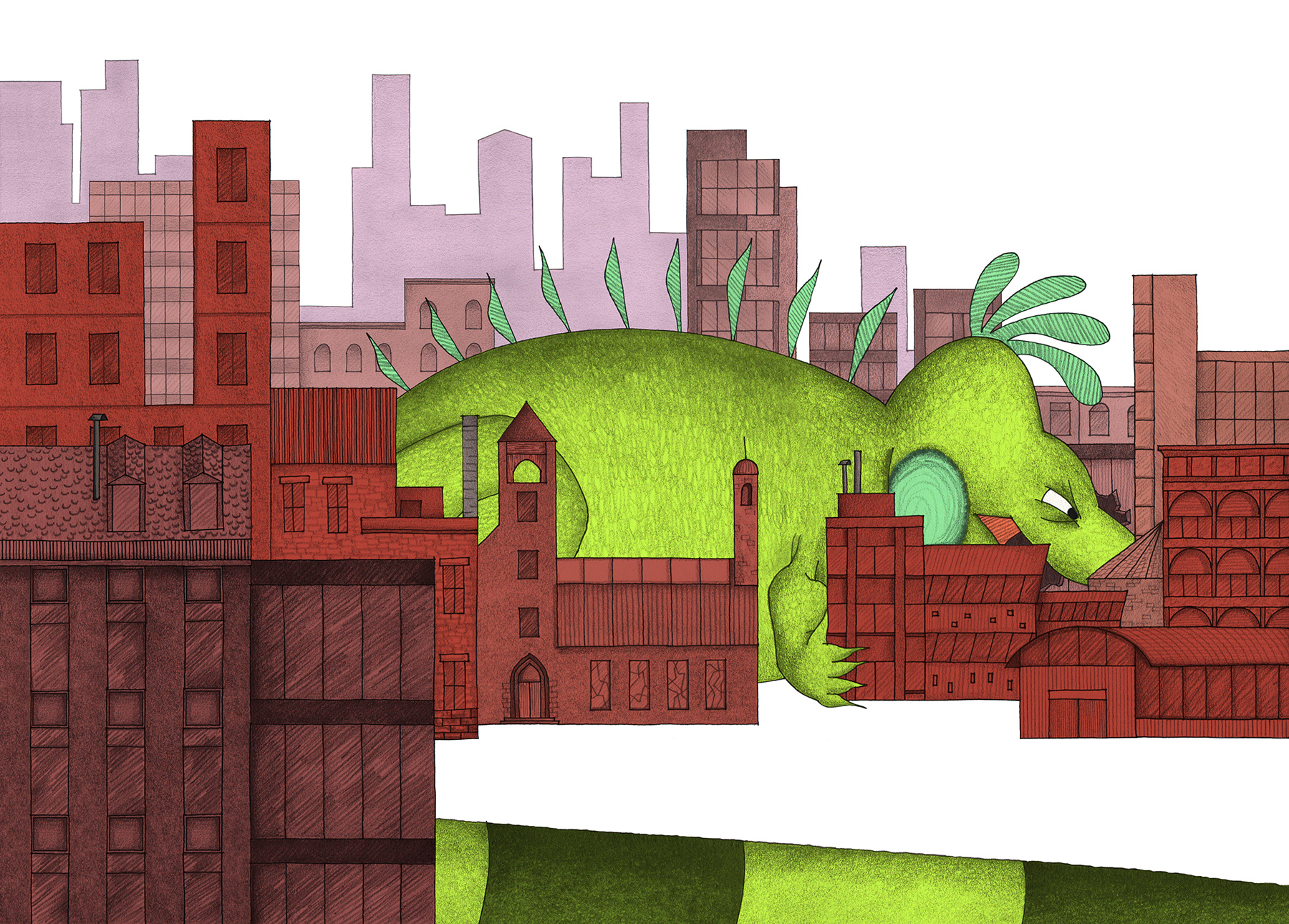
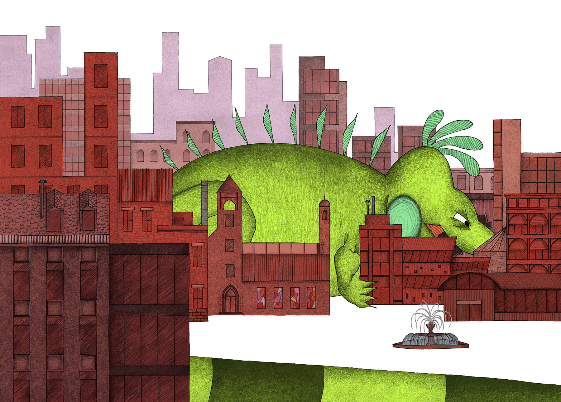
Revisions to this spread were mostly cosmetic as I altered the tail, tones and details. Unintentionally, I had created a "Spot the Differences" puzzle for myself.
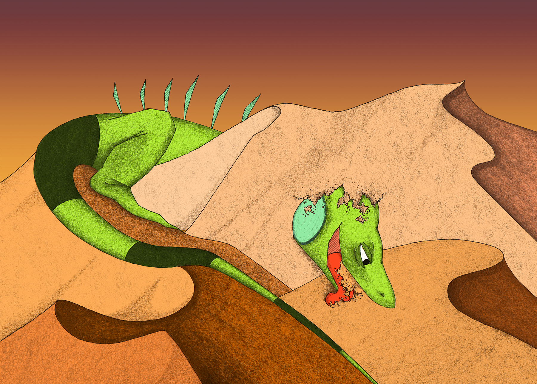
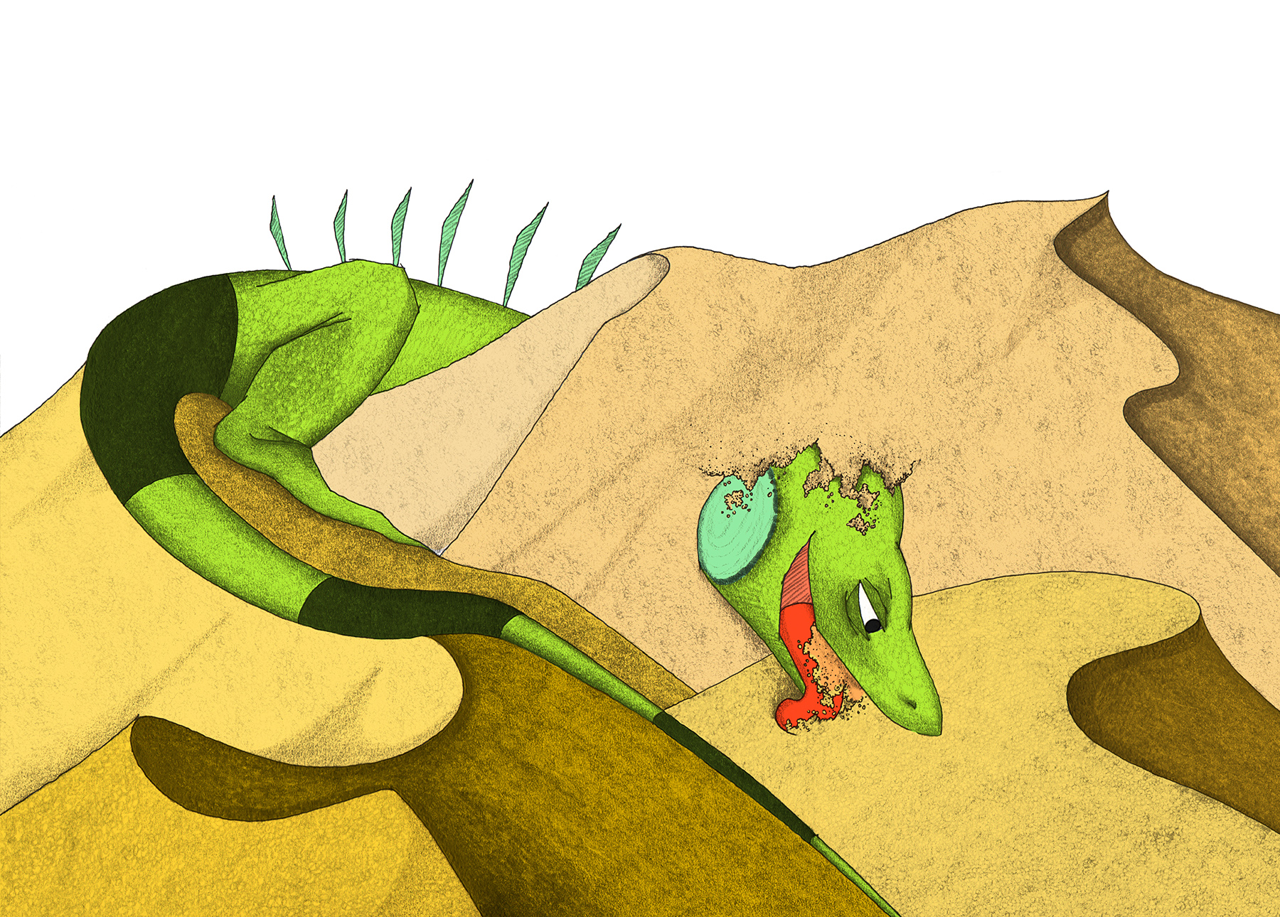
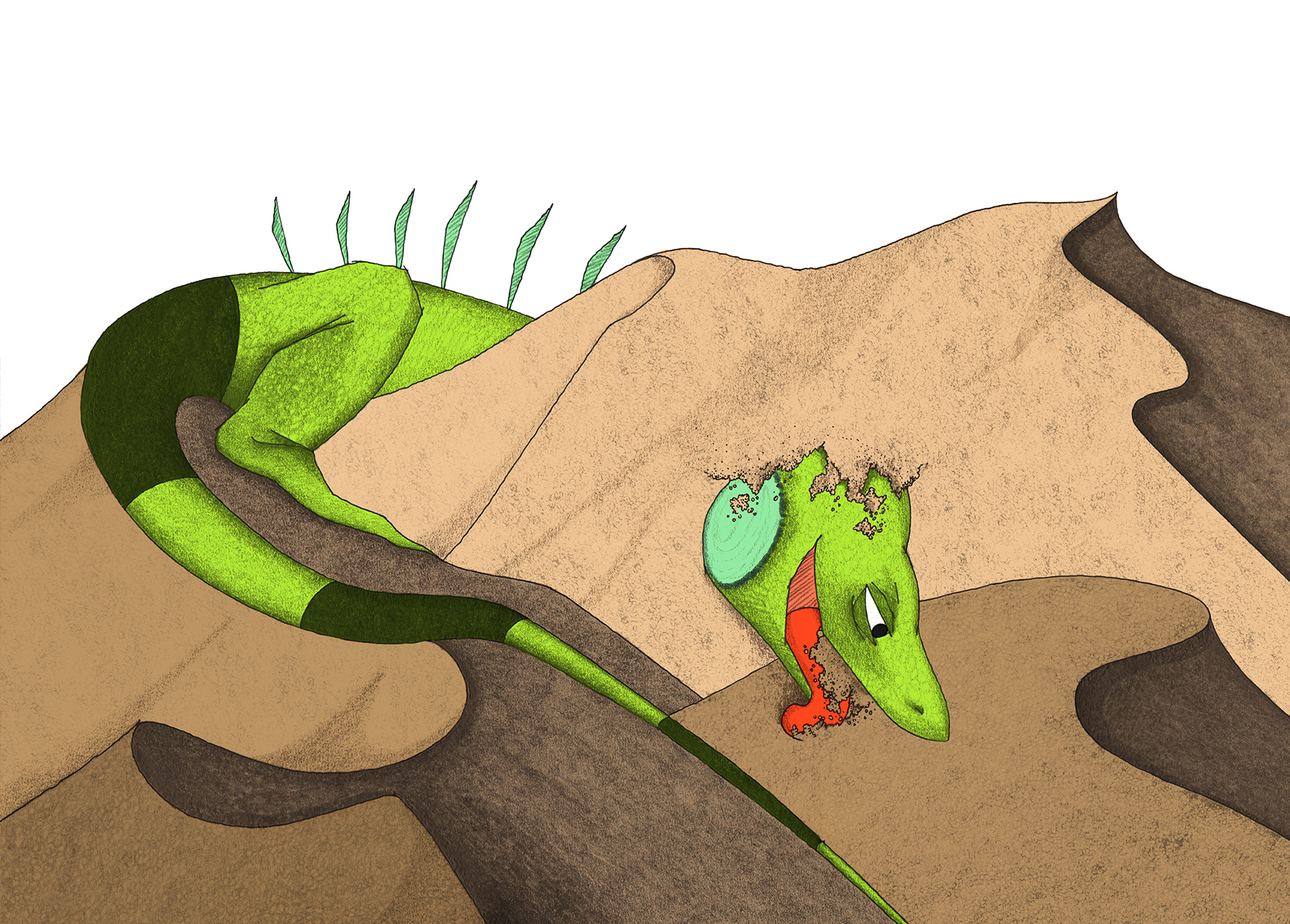
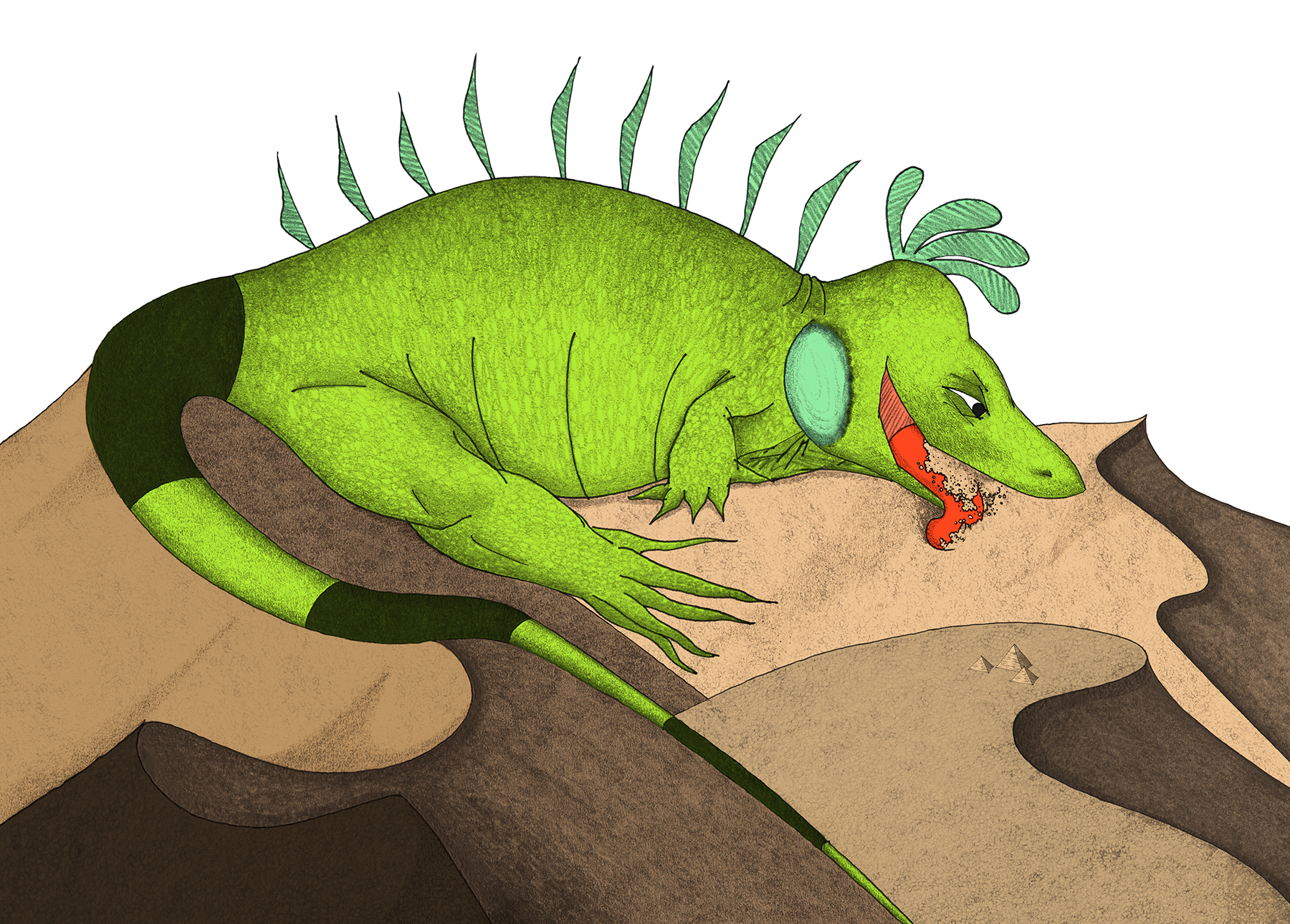
To say that this illustration was the bane of my existence for a few months would be an understatement! There were even times when the spread was removed altogether in favor of a smaller page count, because I just couldn't seem to get Mo's positioning right.
The spread seemed destined for the cutting room floor.
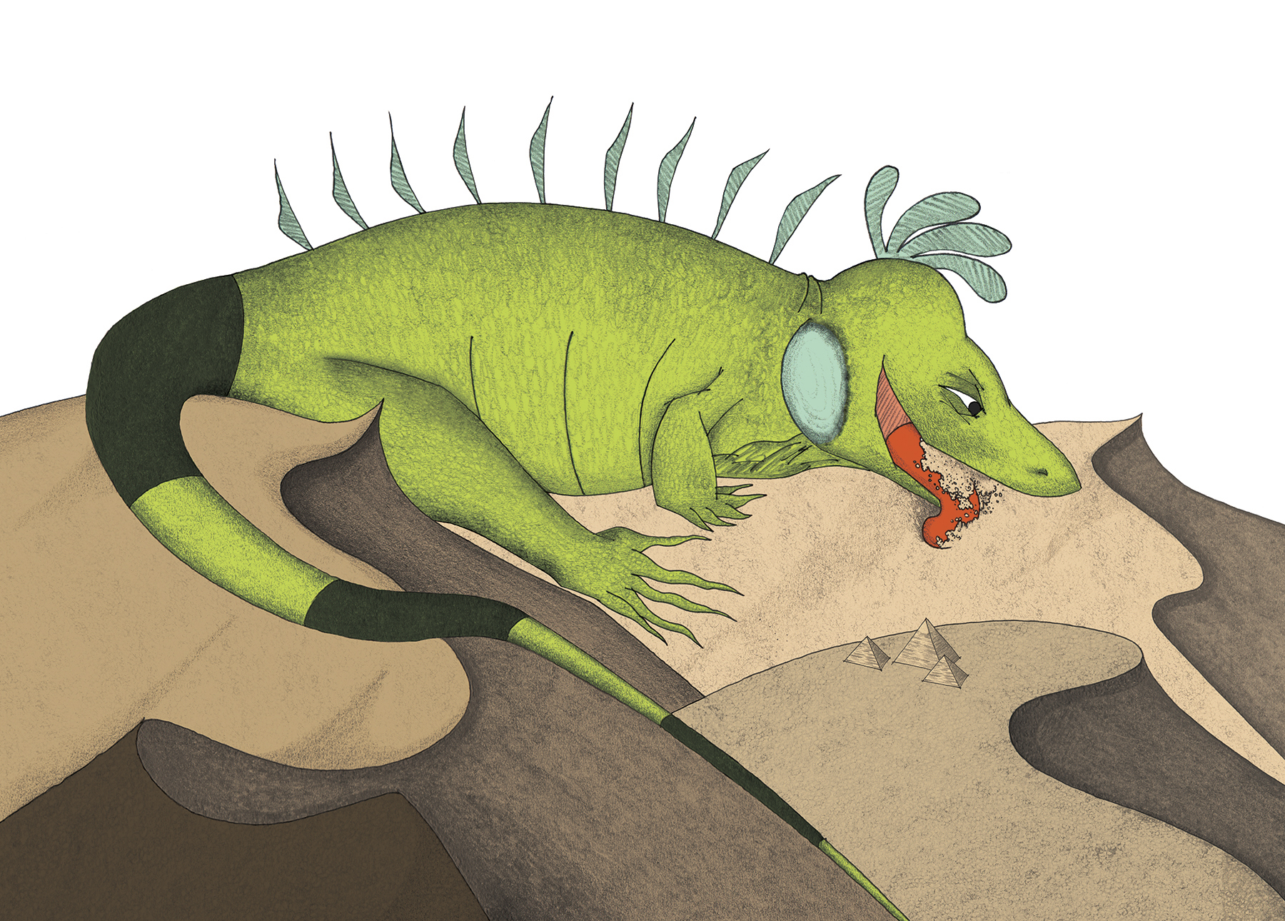
All the raw material was there: Mo is comically larger than a mountain - the size of an entire desert, in fact. His expression shows that he has a renewed focus on consuming everything, and he is guzzling sand like so many crystalline jelly beans. Yet, this drawing eluded me for quite some time.
The evolution of this scene was the most drastic as I pushed, pulled, and generally manhandled the drawing to reach its final form, complete with tiny Giza Necropolis.
**Note: guest appearance in the fourth frame of an iguana thigh fit for an NFL player
