This summer, I was fortunate to speak at a design event at my former office, Bohlin Cywinski Jackson. The format was simple: present 20 slides for 20 seconds each on any design-related topic. I could not miss this opportunity to compare my past role as an architect with my current path in writing and illustrating. Read on for the transcript of the presentation!
1 | Before I worked in architecture - long before - I was a kid (we all were!). And when I was a kid, I thought THIS was how buildings were made.
Of course, eventually, through the practice, I learned there was much more to it.
And just like buildings are created with more than blocks, books are built from more than just words and pictures, and to create a successful kids books requires thinking like one again.
2 | So, I'll walk you through the strangely architectural steps that I took to write and publish my first.
(By the way, the Lego bricks at the top left highlight some parallels between self-publishing and architecture.)
3 | To get in the mood, my very first step was to build my personal library of picture books.
There is so much hard work embedded in this stack of books, so I performed dozens of "book reports for grownups" to borrow lessons from these authors.
I looked for things like proper formatting, page counts, price point, theme and tone.
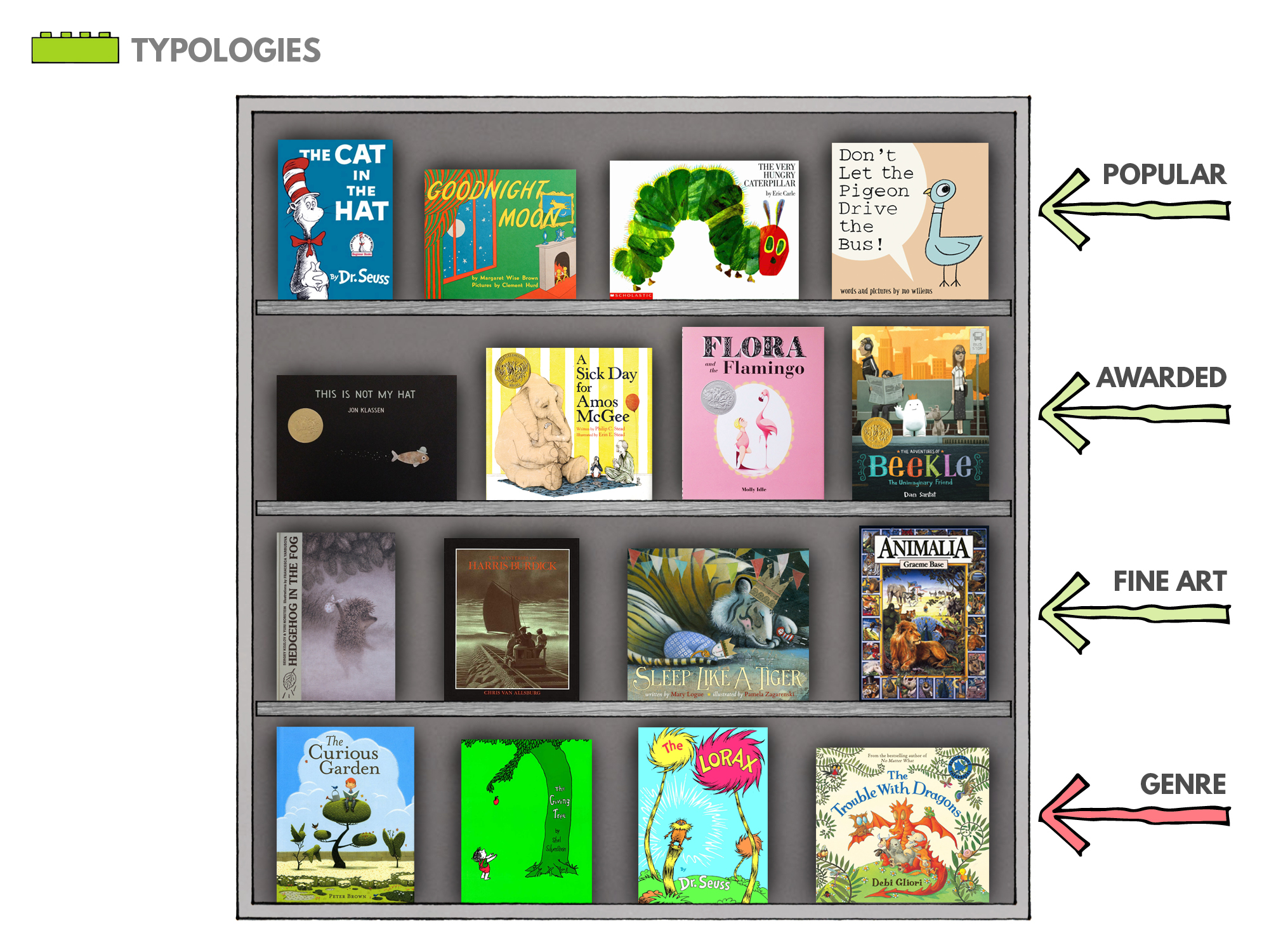
4 | I also studied the market, and defined some broad categories.
There are the ubiquitous books on every kid's shelf, the award-winners, and those that are artistically accomplished.
I am personally drawn to stories that make a meaningful statement about the natural environment, and I saw this as the genre I'd fit in.
5 | But before getting too serious, I took two weeks to flesh out the story I'd been imagining for about a year.
This was me taking a stab at a book, cover-to-cover, in an intense and dedicated time frame.
It was great practice, but this wasn't a story I was ready to write.
6 | So I took a step back - and I identified my mission statement for this project.
Having left a great, steady job for the unknown realm of children's lit, I hoped to create something with a real and positive impact on kids.
Specifically, I wanted to illustrate the carrying capacity of the Earth, or the perils of infinite demand on a finite world.
7 | My roommate at the time told me about this crazy Japanese video game in which a little man rolls an adhesive ball around, collecting bigger and bigger objects.
I liked this concept, and thought it could temper the very heavy notion that capitalism drives the consumption of resources (you know, to make it a bit softer for the kiddos!!).
8 | So who would tell this story?
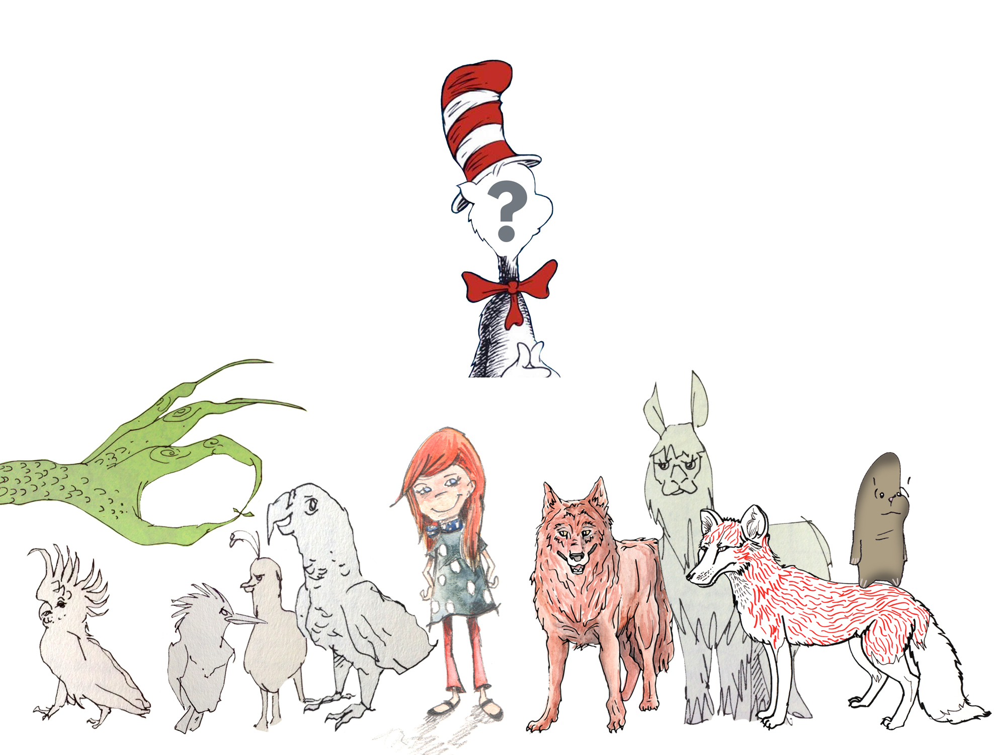
I find that original characters come about by a sort of enforced daydreaming.
Inertia was telling me to reuse characters from the 2-week charette, but I was also really into birds at the time, and I even considered this rather scary, giant green hand...
9 | Ultimately, I woke up one morning and thought an iguana would be perfect. The word is fun to pronounce, and the animal is not especially threatening, although still a little unpredictable.
I spent some time learning iguana anatomy and movement, and training my hand to draw their contours without thinking.
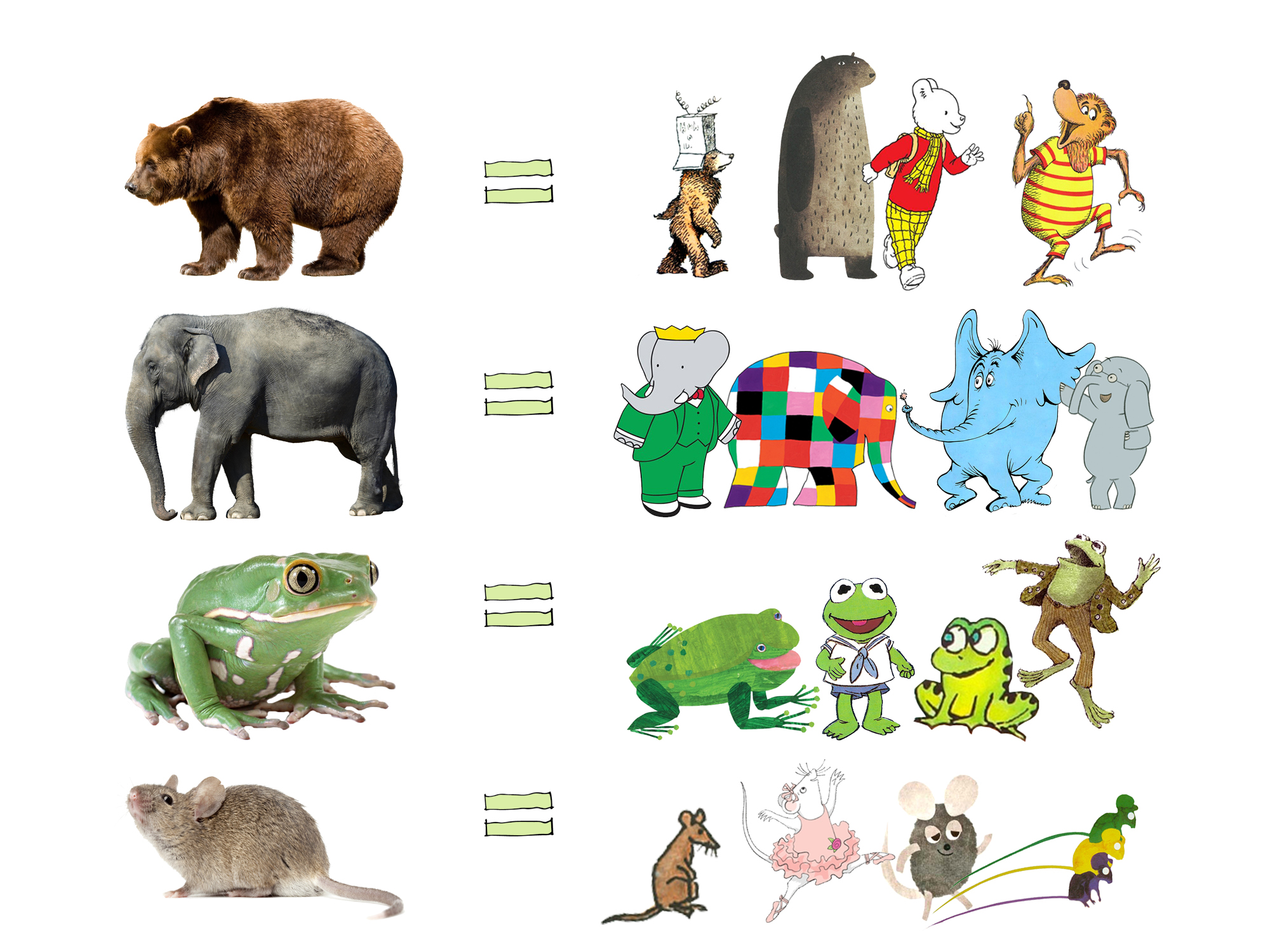
10 | Of course, the most memorable children's book characters are not pure, anatomical replicas of the living thing. Very few children would relate with that realism.
The greatest connection is made when the character is abstracted or personified or somehow fantastical. Also, lovable, a little goofy and not even a hint scary.
(Like these!)
11 | So THIS part was a big deal...
I had the character, but refining his style meant deciding on an overall illustration strategy for the entire book.
I wanted a visual language that was memorable, subtle, textured and somewhat simplified - a style formally basic enough that a child could attempt it.
12 | Now, for any of your creative projects, I highly recommend jury duty! In the free time of a 12-day trial, I fully fleshed out a few plot versions.
I find that I work well in lists and storyboards, much like a filmmaker would.
But beyond that, an average book becomes GREAT with layers and layers of visual information, unifying threads and formal structuring.
13 | In this story, as the iguana grows larger through his consumption, the image consumes more of the page, and there is a dominant color marking each new ecosystem.
It is these extra touches of thought and rigor that I hope help the book to stand out on the shelf!
14 | Story aside, I was still missing something key, and that was a title.
Much like the Japanese video game, or the Powers of Ten (above), this story demonstrates the nature of exponential focus and impact.
The complication of the story comes when the iguana's rampant growth affects more and more of his planet.
15 | In sports, when a team's momentum advances them quickly, it is said that they have "the Big Mo" on their side, and this snowballing effect is central to the rhythm of the story.
AND, coincidentally, when a very young child cries for "MORE!", it often sounds like "Mo"... so the name just fit.
16 | Getting out of your own head is important in design, so I staged a Mid-Review Pin-Up with fellow architects. I also made a mock-up, dummy version of the books to send to the real experts - my small FLEET of nieces and nephews.
The ending basically needed a complete rewrite, and I learned that my text could use a major overhaul.
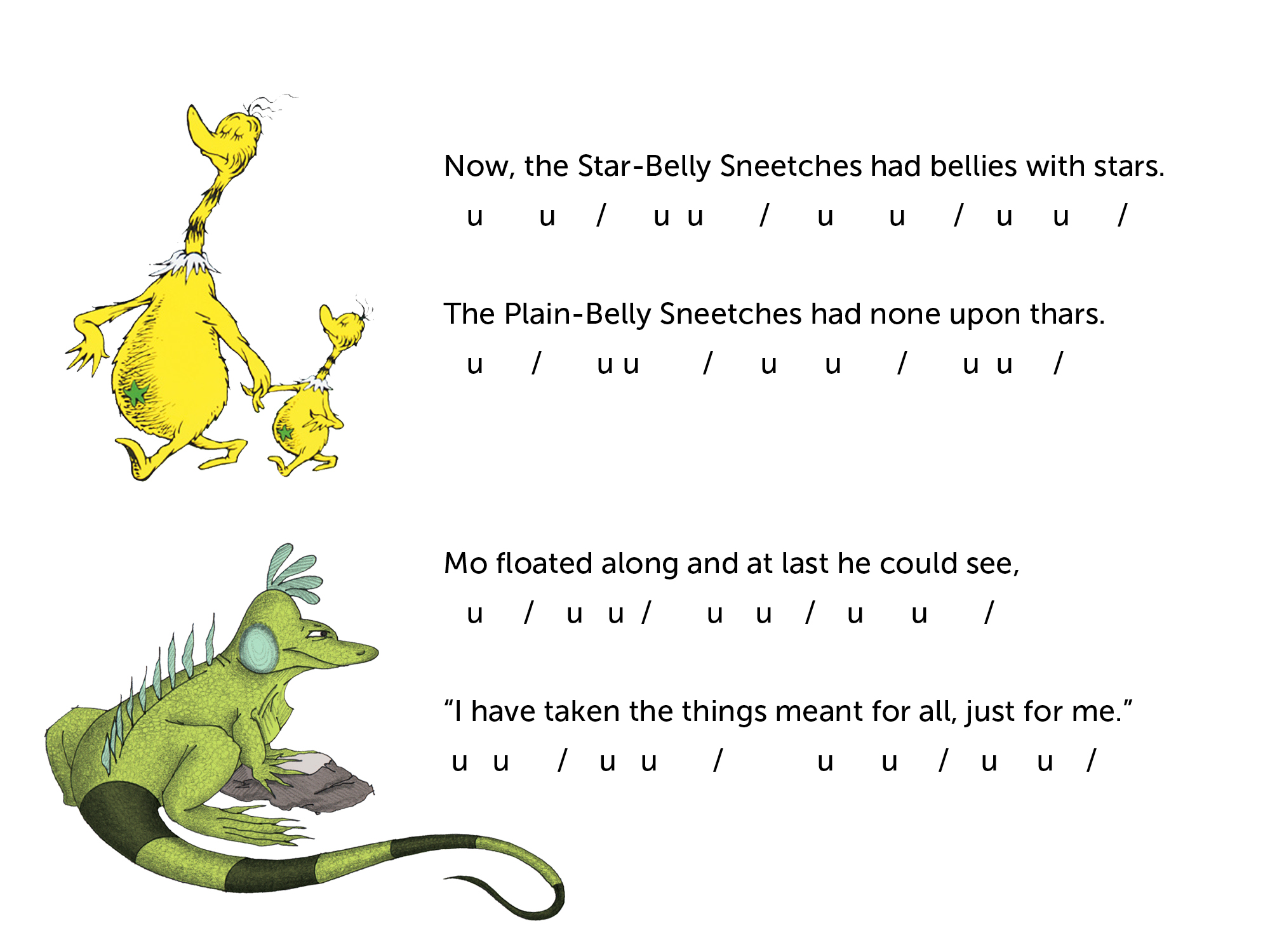
17 | Picture books are unique in that they are typically read out loud, so the story really has to sound good.
Writing in verse is methodical - it's just a series of stressed and unstressed syllables.
I had to reach DEEP into my grade school memory, but also drew inspiration from the master of rhyming couplets for kids, Dr. Seuss.
18 | Yet, even the most solid rhyme scheme will not coax a reader or buyer to pick up your book. That is the job of the cover design!
The cover must be well-composed and eye-catching with a highly legible title, especially at a thumbnail size in our digital shopping age.
It should also introduce the main character and hint at the story within.
19 | My fixations were tested at press time. It was important for me to find a domestic printer, though I did bid out the project to both US and overseas printing houses.
I ultimately chose Lake Book out of Chicago, the printers of Thompson's Elouise.
They won the project with their attention to quality and detail - especially the tight, stitched binding of the spine.
20 | I've identified myself as an architect for so long now that I'm thrown off balance a bit when I'm called an author.
But it's readers like these - my new clients, technically (!!) - who push me to own that title and keep asking, "when's the next one coming out?"


