Some illustrators create story artwork in one fell swoop, but my particular breed of children's illustration rarely (never?) pops out fully-formed. In a 48 page book, I approach each drawing as an independent composition deserving of attention and much revision.
Because I create the artwork by hand and then scan the individual elements to manipulate digitally, I can adjust layout, scale and color selection fairly easily. For any scene, the drawing and composition may have endured dozens of changes over its lifetime!
Let's take a look at one example from the latest, Little Moon.
In the story, the tiny protagonist, a Hawaiian Bobtail Squid, must journey to find home. For me, this odyssey creates the perfect backdrop to introduce various ocean conservation issues to young readers. The vast majority of ocean pollution originates on land, and I wanted to incorporate this topic into the illustrated subtext of Little Moon.
We are all familiar with the devastating impact of ocean debris on sea life. My goal was to convey this to a child reader in a way that is not too scary, but certainly not funny. The illustration began as a thumbnail sketch (enlarged here from its original 1" size):
Fun Fact: at the time of this drawing, I STILL used a flip phone (I'm what you might call a "late adopter"...)! You'll note my homage to my flipper among the ocean trash.
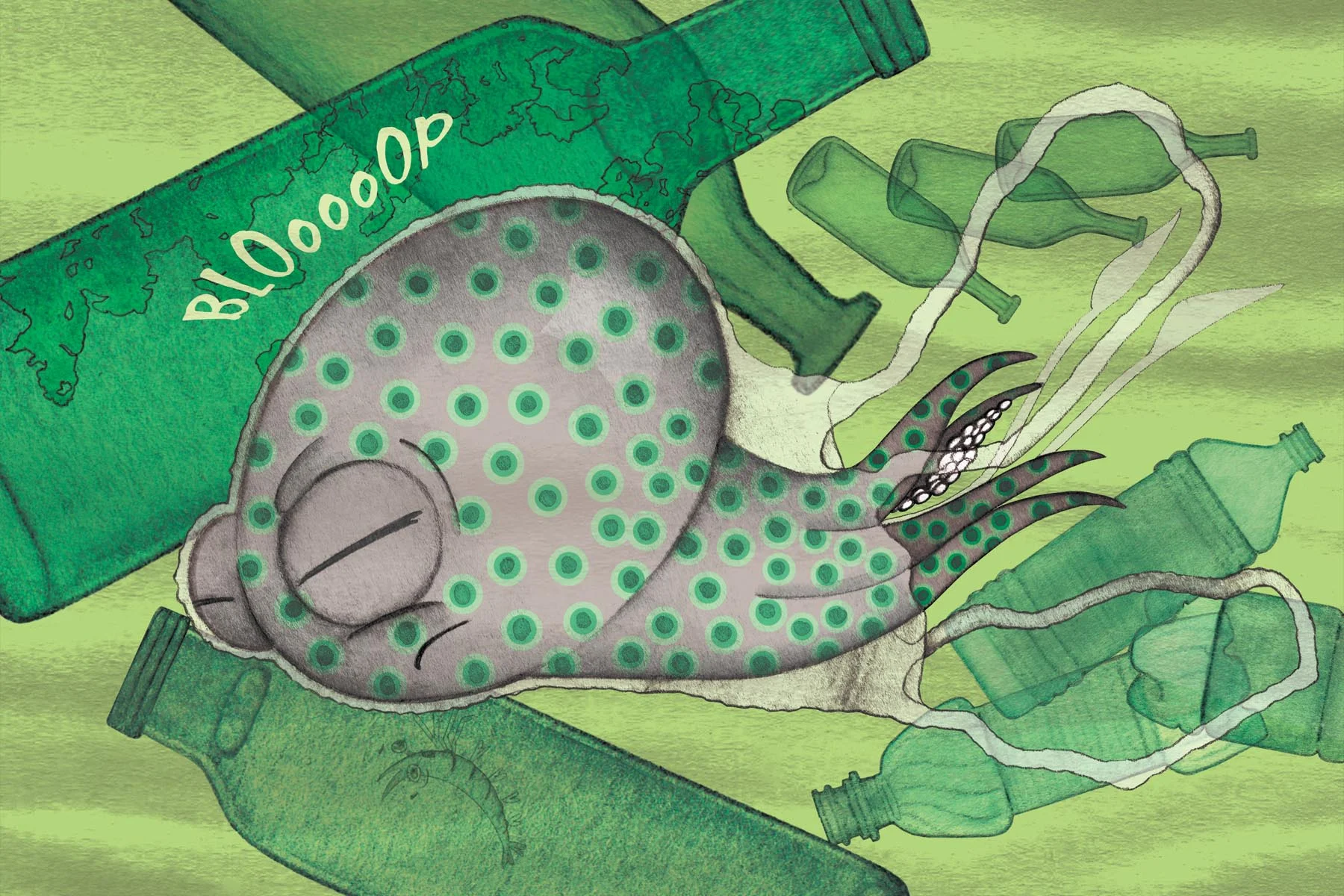
I know that our next generation will have a different relationship with plastic than my own, so it made sense to focus on the effects of plastic in the ocean. The first concept here was to trap the squid in a plastic bag. From this, more detailed composition sketches followed:
Flipper is still there!!
Editing is key here. Although a jumble of trash of many types does get the point across, it doesn't look too visually-pleasing as an illustration. Just as in my architectural education, the first concepts tend to be messy with ideas – there is a natural tendency to just "do them all". Selective editing is so important to narrowing down a broad idea to its main intent. In these early studies, I simplified the types of background ocean trash to bottles and bags.
I soon found out that drawing a plastic bag with a pencil is WAY easier than painting one with watercolors:
Also, what sound does a squid swimming into a bag make? At the time, I thought "BLOooOOP", but in hindsight, maybe "PFFFT"? Onomatopoeias are tough.
After sharing these versions of the illustration with my test audience, I received mostly confusion:
...and no amount of color adjustments could clarify for readers what exactly was happening in this scene. I may be relatively new at illustrating picture books, but I know that if a reader can't even interpret what is happening in an illustration, that's a bad thing!
So I had to rethink the image.
Source: NOAA (National Oceanic & Atmospheric Association
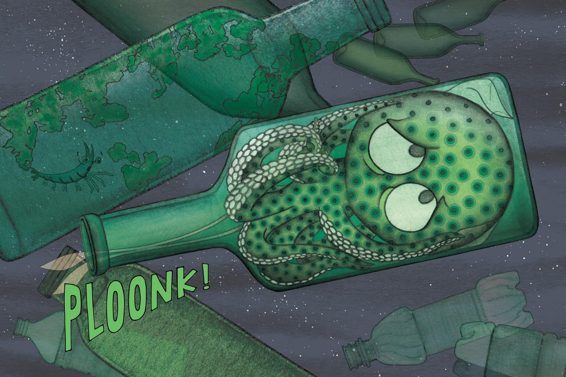
I was reminded of this diagram I'd found in my story research. Although plastic grocery bags are perhaps some of the most prevalent land objects in the ocean (and some of the most confusing and deadly for ocean life...and some of the most preventable (click here) for coastal communities!), it turns out that plastic and glass bottles decompose much slower. This new idea for a vessel seemed much nicer as an illustrated element:
PLOONK, right?
The color scheme for the final image was cross-referenced and coordinated with the tones of the entire book to imply an underlying "murkiness" to these harrowing ocean scenarios. The tiny, "snowy" flecks are reminders that even at the scale of a tiny squid, there are even tinier beings floating around in the ocean, too small to detect. As a whole, the image describes just one obstacle in Little Moon's brave journey home.


